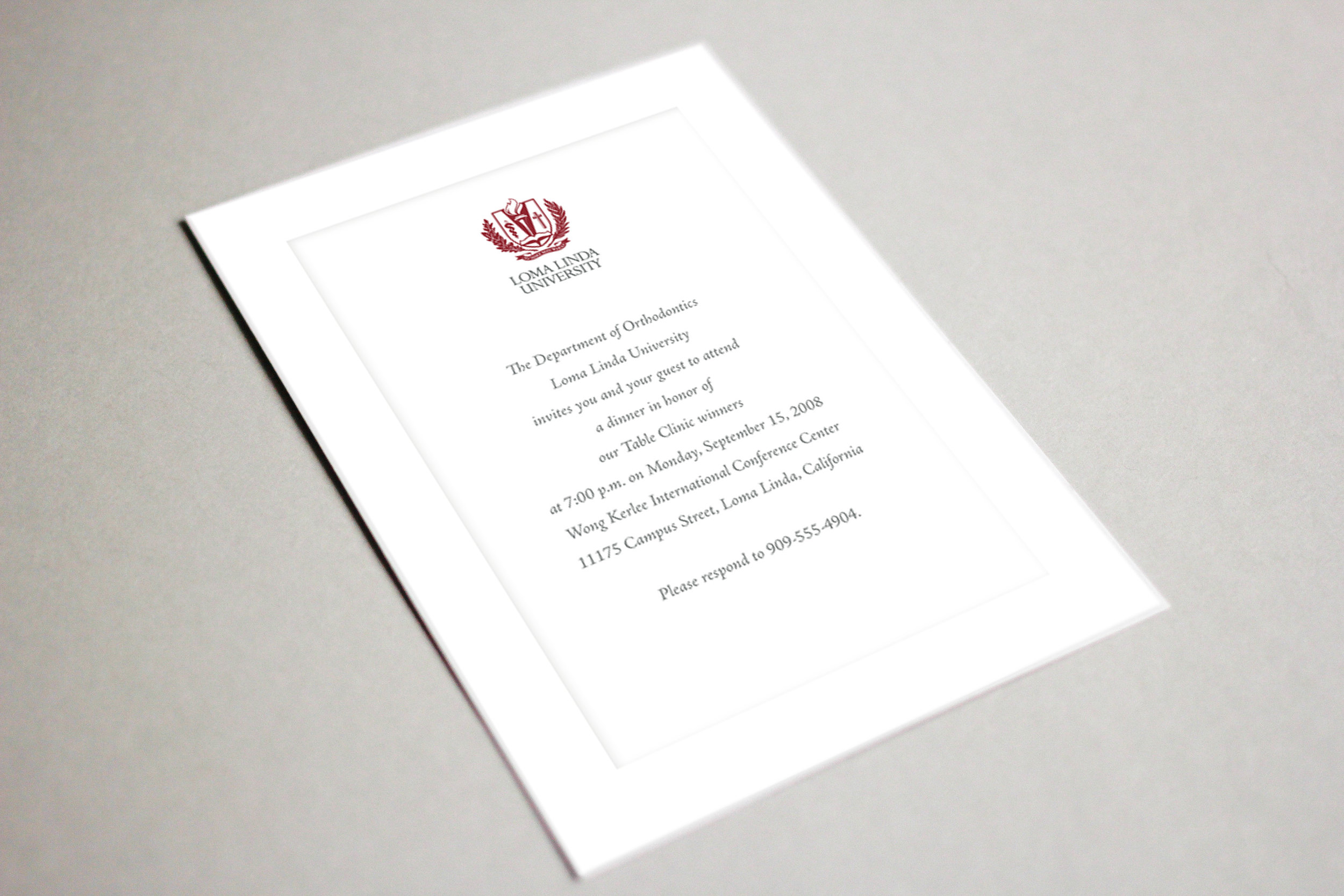
Loma Linda University
Simplify a complex brand and create a consistent, updated visual brand for the system
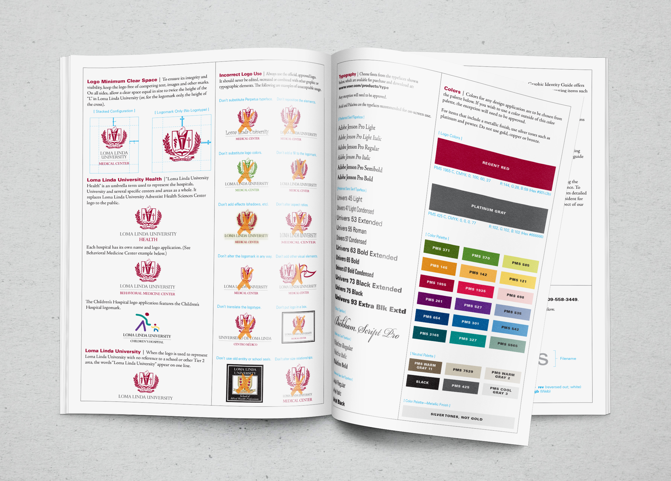
CHALLENGE: Loma Linda University Adventist Health Sciences Center is a world-class healthcare organization, but at the time of this project, their visual brand and logo lagged their reality. While their previous logo was dated and they had at least 27 different brand colors and 49 different logos. they believed that a new visual brand would signal who they were becoming and could include a simpler method of ensuring compliance. To achieve this, they wanted to embark on a process that would allow for broad internal and external input and would both clarify and build support for their essential brand attributes.
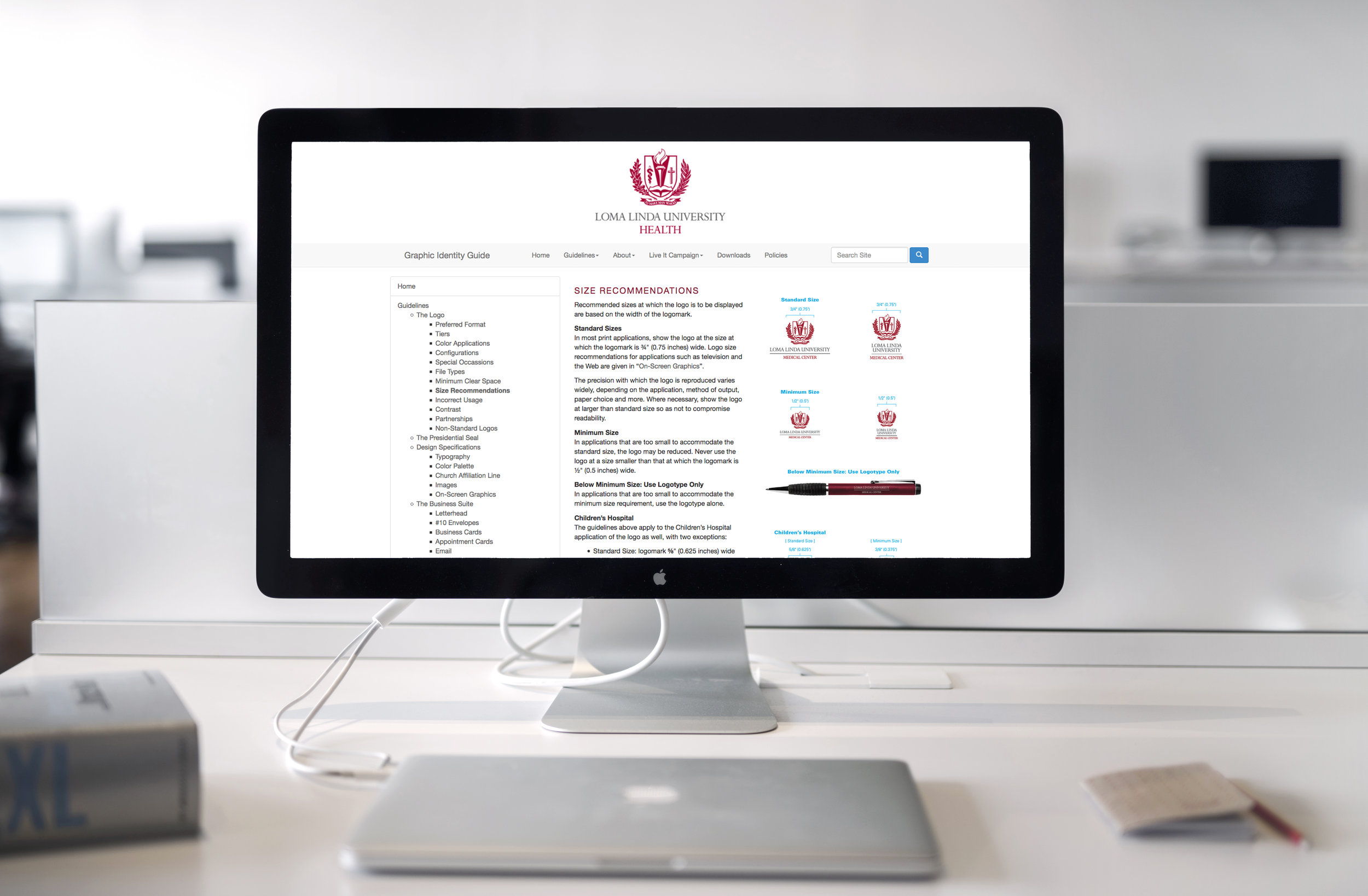
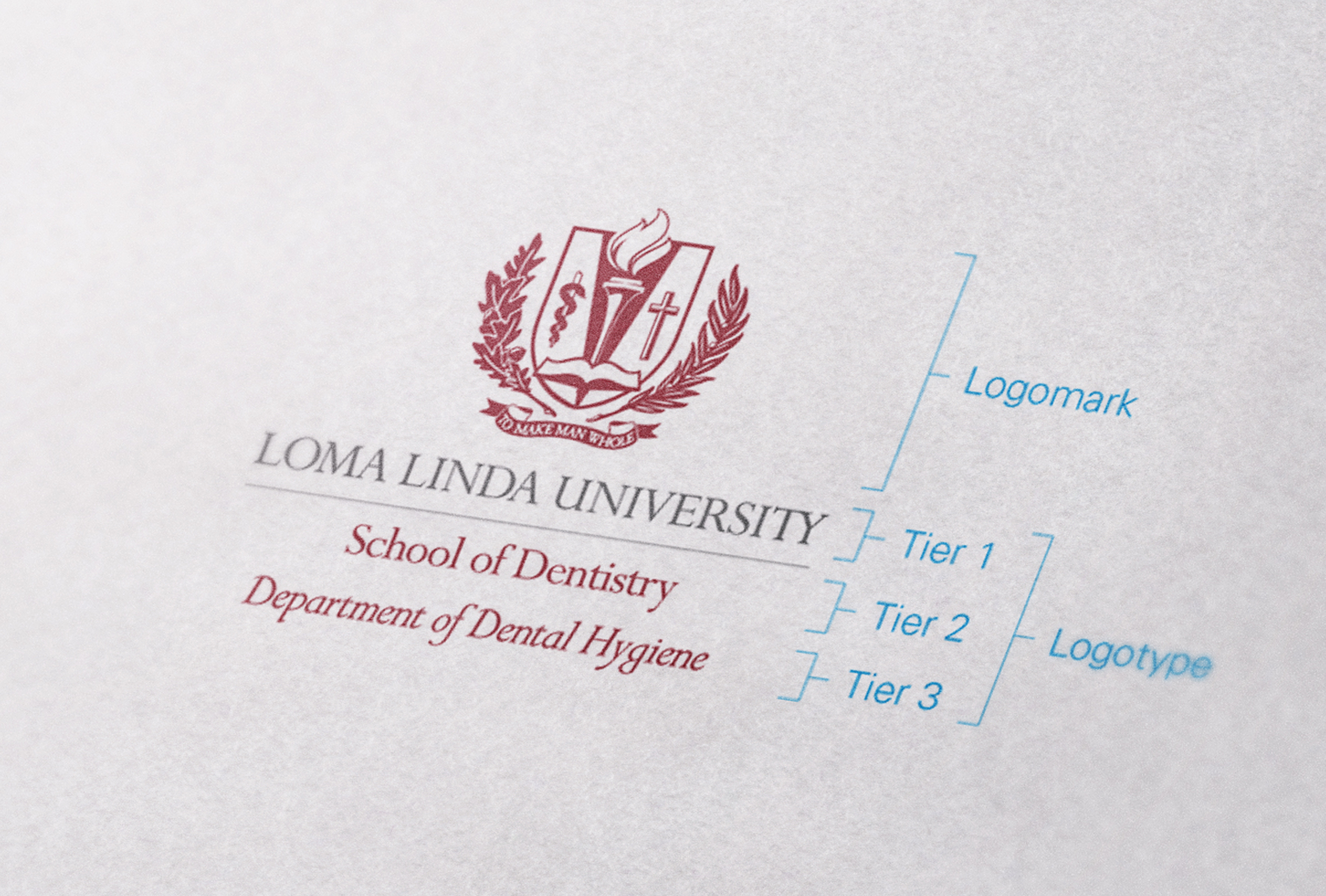
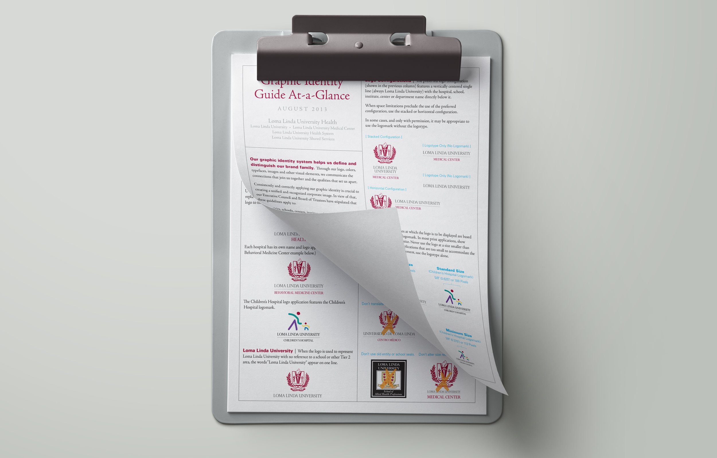
SOLUTION: CMBell conducted a readiness assessment, conducted internal and external research to define their brand message, and developed several new logos for testing. The client wanted to retain their seal, so we provided an updated version, a visual brand architecture that would guide its use, and an on-line visual identity guide that minimized the manual logo management and helped ensure brand compliance.
RESULT: The client participated in organization-wide discussions about their brand and implemented a simpler, consistent visual brand with digital resources that allowed for easier logo management. Their updated seal was integrated into a more modern icon that more accurately represented their world-class status.